Color is a powerful tool in design, influencing mood, perception, and style. At ClashCGG, we carefully consider color theory principles when creating our handcrafted accessories, ensuring that each piece not only stands out but also complements a variety of styles and settings.

The Psychology of Color in Accessories
Before diving into specific color combinations, it's worth understanding how colors affect us psychologically. Colors evoke emotional responses, cultural associations, and can even influence our behavior—making color selection a crucial element in accessory design.
For instance, warm tones like reds and oranges tend to evoke energy and passion, while cool blues and greens suggest calmness and stability. Neutrals like black, white, and tan provide versatility and timelessness.
At ClashCGG, we consider these psychological effects when designing accessories for different purposes. A statement piece might incorporate bold, energetic colors to draw attention, while an everyday staple might feature neutral tones with subtle color accents for versatility.
The Color Wheel: Foundation of Harmonious Design
The color wheel is our starting point for creating harmonious color schemes. This tool, which arranges colors in a circular spectrum, helps us identify combinations that work well together based on their relationships on the wheel.
Here are some of the color relationships we often utilize in our designs:
Complementary Colors
Complementary colors sit opposite each other on the color wheel—like blue and orange, or purple and yellow. When used together, they create maximum contrast and vibrancy. In accessories, we often use complementary colors for bold statements or to create focal points.
For example, our Autumn Horizon tote features a deep navy leather body with copper hardware and orange stitching details—creating a striking yet sophisticated contrast that draws the eye without overwhelming.
Analogous Colors
Analogous color schemes use colors adjacent to each other on the wheel—like blue, blue-green, and green. These combinations create a sense of harmony and cohesion, making them perfect for accessories that need to be versatile and easy to pair with different outfits.
Our Forest Whispers collection demonstrates this principle with a palette of sage green, olive, and teal—colors that flow seamlessly into each other while providing enough variety to create visual interest.
Triadic Colors
Triadic color schemes use three colors equally spaced around the color wheel. This arrangement creates a vibrant but balanced look. We often use triadic schemes in our more artistic, statement pieces.
The Summer Festival clutch is an example of triadic harmony, combining coral red, mustard yellow, and cobalt blue in a woven pattern that's eye-catching yet surprisingly versatile.
Natural Dyeing: Creating Our Unique Color Palette
At ClashCGG, many of our colors come from natural dyeing processes, which results in unique, complex hues that synthetic dyes can't replicate. Natural dyes create colors with depth and subtle variations that change in different lighting conditions, adding another dimension to our designs.
Our natural color palette includes:
- Indigo - Derived from the indigo plant, creating deep blues with subtle purple undertones
- Madder root - Produces warm reds and terracottas
- Osage orange - Creates golden yellows
- Logwood - Yields rich purples and deep grays
- Walnut - Provides warm, rich browns
These natural dyes not only produce beautiful colors but also align with our commitment to sustainable practices. Each naturally dyed piece tells a story of its creation, with subtle variations that make it truly unique.
Seasonal Color Considerations
While we believe in creating timeless pieces that transcend seasonal trends, we do consider seasonal color psychology when designing our collections. These considerations influence not just the primary colors of a piece but also the accents and combinations.
Spring/Summer Palettes
Our warmer season collections often incorporate:
- Lighter, brighter tones that reflect the increased natural light
- Fresh greens and blues inspired by new growth and clear skies
- Soft pastels balanced with neutral bases for versatility
Fall/Winter Palettes
As the seasons change, our color palette shifts to:
- Richer, deeper tones that absorb and reflect warmth
- Earth tones inspired by the changing landscape
- Jewel tones like emerald, sapphire, and garnet for elegance and depth
Color and Material Interaction
One fascinating aspect of color in accessory design is how it interacts with different materials. The same color can look dramatically different depending on the material's texture, reflectivity, and natural characteristics.
For example:
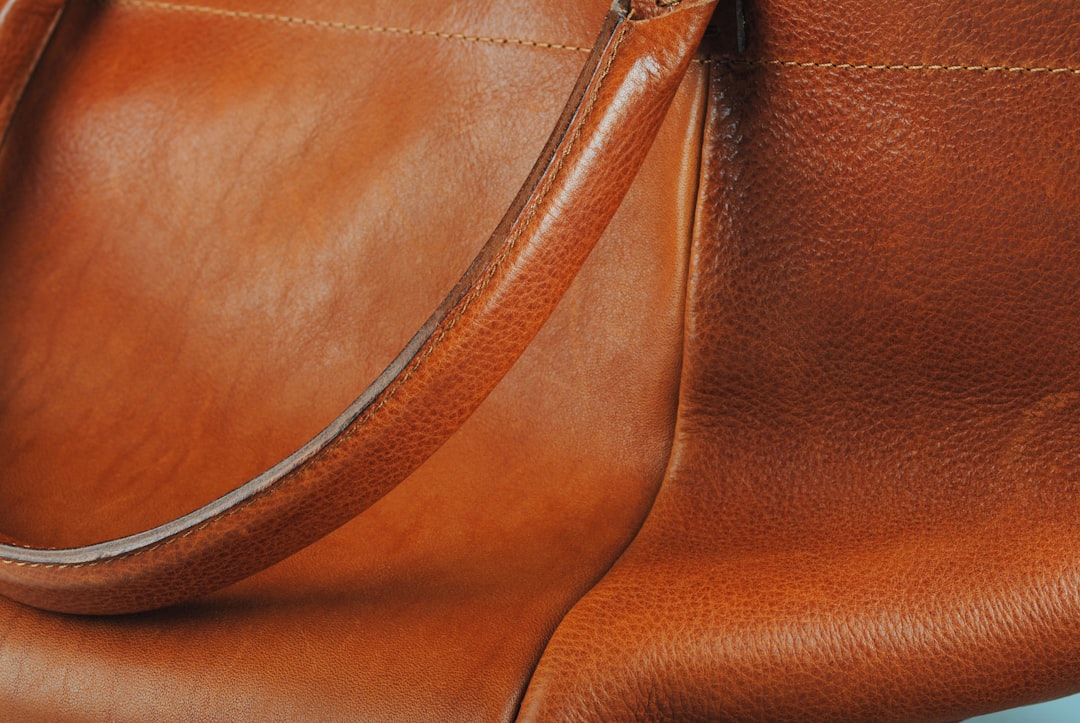
- Leather naturally darkens and develops a patina over time, changing the color depth
- Silk reflects light differently than cotton, creating different perceptions of the same hue
- The grain in wood or the natural variations in stone add complexity to solid colors
We consider these interactions when selecting materials and colors. Sometimes we deliberately choose combinations that will evolve beautifully together over time, creating accessories that not only complement your style today but continue to develop character as they age.
Neutrals: The Backbone of Versatile Design
While vibrant colors often steal the spotlight, neutral tones form the foundation of many of our most beloved designs. Far from being boring, neutrals can be rich, complex, and sophisticated.
Our approach to neutrals includes:
- Using a spectrum of neutrals rather than basic black or brown
- Incorporating subtle textures to add depth to neutral surfaces
- Combining different neutral tones in a single piece for sophisticated contrast
- Adding small pops of color to neutral bases for versatile yet interesting designs
The Everyday Elegance collection exemplifies this approach, featuring accessories in sophisticated taupe, charcoal, and ivory with carefully placed color accents that can complement a wide range of wardrobes.
Balancing Timelessness and Trends
As a brand committed to creating accessories that last, we aim to strike a balance between timeless color choices and contemporary relevance. Our approach includes:
- Building designs around core colors with proven longevity
- Incorporating trending colors in smaller, replaceable elements
- Developing signature color combinations that transcend seasonal trends
This philosophy allows our customers to invest in pieces that won't look dated next season while still enjoying current color trends in a sustainable way.
Finding Your Personal Color Harmony
While we apply color theory principles in our designs, we also recognize that personal color preferences are deeply individual. What resonates with one person might not with another, and that's perfectly fine.
We encourage our customers to consider their own color affinities when selecting accessories:
- Which colors make you feel confident and comfortable?
- What colors predominate in your wardrobe?
- Are you drawn to bold statements or subtle elegance?
The perfect accessory should feel like an extension of yourself—complementing your personal style while perhaps adding a new dimension to it. Whether you're drawn to the rich earth tones of our Heritage collection or the vibrant contrasts of our Urban Edge pieces, there's a color story at ClashCGG that resonates with your own.
Color is just one element of design, but it's one that speaks directly to our emotions and senses. At ClashCGG, we continue to explore the endless possibilities of color, creating accessories that are not just functional objects but small works of art that bring beauty and joy to everyday life.